Upcoming Classes:
Creating Sacred Space through Veil Painting - an online workshop
Paper:
1 full sheet (22ʺx30ʺ) Arches 100% cotton watercolor paper, Cold Press or Rough, 140lb (300gms). We will be cutting this into smaller sizes for various exercises.
(Saunders-Waterford, Winsor-Newton, Fabriano or other brands may be suitable if they are 100% cotton, same weight and surface.)
“Blocks” of watercolor paper are also a possibility, at least 8×10, but these are more expensive since they have more sheets and don’t provide you with the option of having a larger sheet as well—unless you have a large block, e.g., 11×14, 12×16.)
Brushes:
- 2 Flat Watercolor brushes, either 3/4ʺ or 1ʺ wide. Part synthetic/part natural hair works well, but if you have one already, use that. If you only have one, you can use another brush as a water brush.
- 1 Round Watercolor brush, size 8, 10, or 12 for more detail toward the end.
- 1 small brush of any kind (could even be bristle) for mixing paint
Other materials:
- Absorbent rag or paper towels
- Sponge
- 2 water containers (can be glass or plastic, 1 pt – 1 qt)
- Several small containers for mixing and holding washes. These can be lids, small bowls, plastic salsa containers from restaurants, small glasses, saucers, whatever you have. The indentations on palettes are not generally large enough. Even paper cups could do in a pinch.
- Masking tape, 1ʺ or wider. Since we will be working on 1/4 sheet or smaller, we can get by with masking tape instead of having to stretch our papers using watercolor tape. (You will receive instructions on how to do this in case you want to in the future.)
- Painting board (at least 13ʺx17ʺ but larger than 11ʺx15ʺ) – could be 3/16ʺ foam core, 1/4ʺ birch or mahogany plywood, masonite, plastic, melamine, plexiglass, etc.
- Watercolor paper test strips – can be cut from your paper or use scraps from other projects.
- Pigments – use artist’s quality watercolor pigments, not student grade (e.g., Winsor Newton, Schmincke, Daniel Smith, DaVinci, etc.) If you already have a variety of colors on hand, you can use them. It would be good to have a red (magenta, carmine, red or vermilion), yellow and blue (cobalt blue or ultramarine), possibly burnt sienna or payne’s gray, and viridian or phthalo green. Basically, you’ll need a warm color, a cool color, yellow, viridian and an optional earth tone. If you are buying pigments for the first time, small tubes (5ml) are fine. I would suggest Carmine (for the red), Hansa Yellow Medium or Cadmium Yellow Light (for the yellow) and Ultramarine Blue (for the blue), Burnt Sienna or Payne's Gray (for an earth tone), and Viridian (green) or Phthalo Green.
If you have a full sheet of watercolor paper (22"x30") that you will be using, you could cut it down ahead of time. If you cut it in half in both directions, you will have 4 sheets that are ~11"x15". These are called "quarter sheets" and are pretty much the largest size for which you could use masking tape instead of having to stretch your paper. (See the handout on how to stretch watercolor paper, in case you would like to do that.) Then, cut two of those quarter sheets in half again, so you will have 4 smaller sheets ~11"x7.5" (eighth sheets) and two quarter sheets. Whatever paper you are using, go ahead and tape it down on all sides. You will need at least two pieces around this size for the first class.
A hair dryer will help with drying the pieces more quickly, so we can make the most of our time together. You will also need something to prop the top of your board on if you have it on a table—a book, block, small box, purse, etc., ~1.5-2" high. There is also the option of propping your board in your lap and leaning it against your table. Please have all your other supplies on hand. You can half fill your two water containers so they are ready.
Depending on the size of your painting board, it would be good if you can tape at least two 11"x7.5" sheets to it. It might also be possible to use the back of it if needed. You could temporarily create more boards if necessary, using the cardboard from the back of pads or maybe even a cutting board. In this way, you could work on 2 or more pieces at a time to practice different techniques.
Welcome - and thank you for joining this online class: Creating Sacred Space through Veil Painting, originally recorded Oct 19-21, 2021, with the Introductory Talk on Oct 13, 2021.
We have an ambitious goal with this workshop, which is to try to cover essential aspects of both color and veil painting. It will be a comprehensive encounter, whether as introduction or review. Since you have purchased a recording of this class, you can refer back to it as needed.
Ideally, the prelude to Veil Painting would be work in Light and Darkness using charcoal, reflecting the fact that color originates in the meeting of L&D. Since we don’t have enough time to include that in this workshop, we refer to the L&D pictures, also shown in the introductory talk. All of these interactions of L&D represent different color interactions.
Our focus today: Boundaries and Washes
- Different kinds of boundaries—diffuse, soft, firm and hard edges (refer to handout, see examples)
- Review of materials; demonstration of how to mix a wash with a dab of paint on the side of the container and some water in the bottom, wetting your mixing brush and adding just a little pigment at a time, until it is the desired strength
- Intro of 2-brush technique; ways to differentiate water brush from pigment brush
- Review of how to hold the brush, pressure and pace
- Different kinds of washes—flat, gradated light to dark or vv, gradated to different color; have different dilutions of paint or use a wide waterline to overlap into. One color into another could also be a soft edge.
- An exception from painting wet into dry: Can pre-wet an area and then apply the wash. This helps to avoid stripes with some pigments or to create a more dynamic area. You can also ‘charge’ a wet wash with a touch of color.
- How to optimally position the board for each wash, with the widest part towards you.
- Can use pencil marks on tape as guides for washes
- Can use light pencil lines on painting if don’t paint over them – erase after wash is painted
- Use the backs of your fingers to test if the paper is dry (it will feel cool if wet)
- Refill brush if needed on initial stroke or go back immediately and ‘charge’ the wash with more liquid
- Remember that watercolor dries lighter, so you may need to add more pigment than you might think to create a noticeable shift in the color. Experiment on a test strip, holding it at an angle rather than flat so you can see how the wash will flow.
Exercises:
Flat washes and hard edges behind the light in blues; soft edges on sides at end
- Experience the concave movements of the blues giving space
- Note how even hard edges can be less apparent after several washes over them. This will also depend on the nature of the pigment, e.g., ‘staining’ pigments will hold on to their edge more.
- Show it gets darker toward the sides with a darker wash of blue or a toned blue on either side of the light. Painting with your board rotated to the side, use a water line first to create a soft edge.
Gradated washes
- Divide one of your 1/8th sheets in half with masking tape. Using either blue or red, on one side transition down from lighter to darker, creating a gradual diffusion of intermediate values as you go down. Have 2-3 dilutions of color pre- mixed.
- On the other side, have blue gradate into red, pre-mixing at least one intermediate color. You could either work toward a gradual gradation—no hard edges—or create a quicker change with a soft edge, just overlapping one stroke, creating 3 bands of color (blue, violet, red) with soft edges between. Better yet, try both! With color changes in small areas, you may need to soak up the bead some before the next stroke, so it doesn’t get too diluted by the color above it.
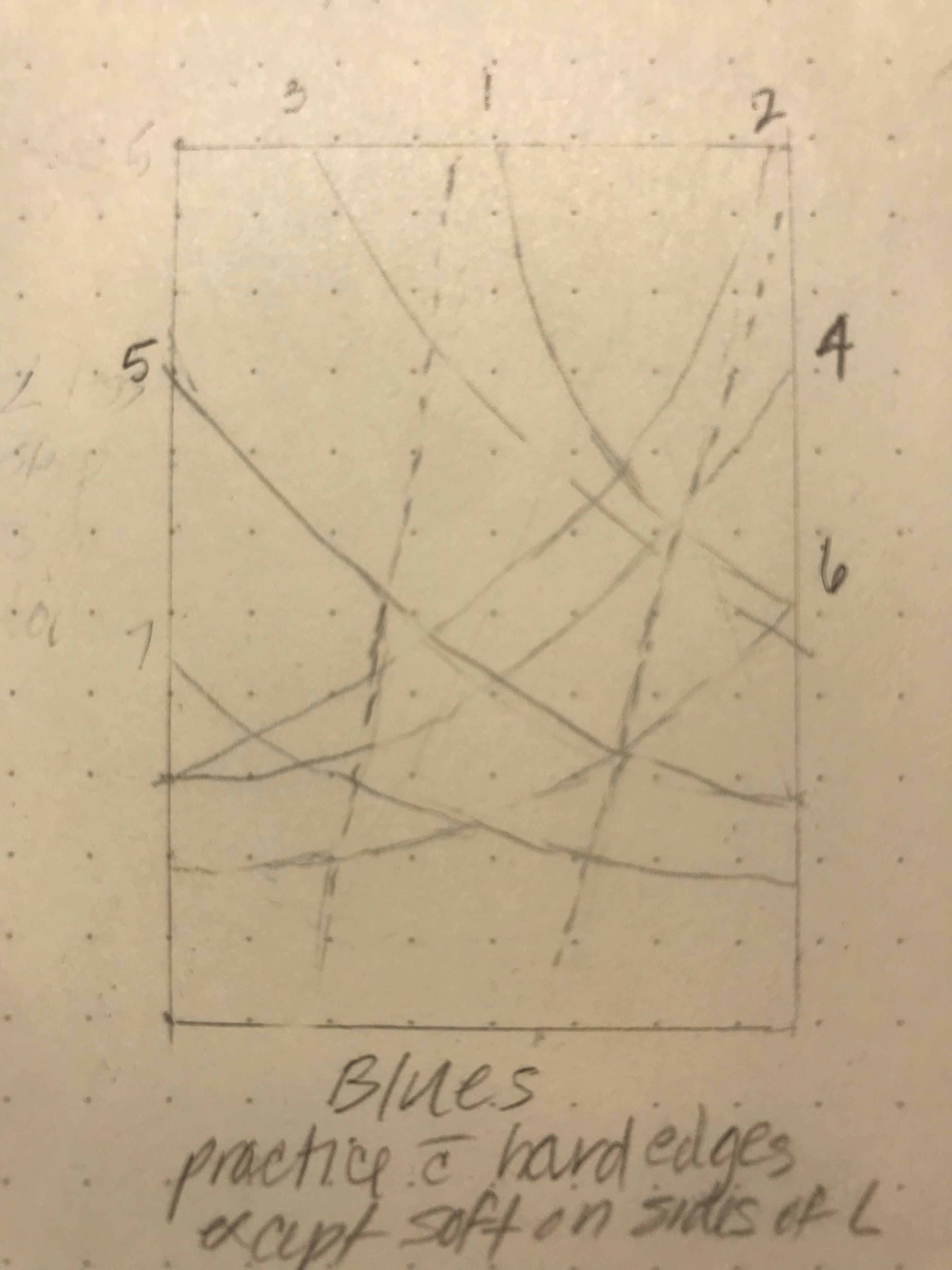
The diagram for the first blue exercise we did today is included with the handouts. We did the first 4 washes working down from the top in class today. If you would like, you could do the next 2 washes a little darker and the final one at the bottom a little darker still. (You could reference my diagram or feel free to create your own concave gestures.) All these washes have hard edges (no water line was used first to soften them).
The final step is to create a somewhat diagonal path for the light. You do this by turning your piece on its side and doing a long straight water line to show one side of the light (which has a straight path), followed by one of your darker blue mixtures overlapping it part way and then paint to the tape. When that wash has settled in a bit (no longer shiny or flowing), you can rotate your board to the other side and do the same thing. This creates a lighter path in the middle where the light shines down. Since these last two washes have soft edges, note how they create a more atmospheric feeling, whereas the hard edges are totally formed. Even hard edges can appear softened a bit to firm when we paint over them with subsequent washes. Hard edges with a strong value contrast are more striking than hard edges with a small value contrast.
For the second class, please tape down your 1/4 sheet of watercolor paper (~11"x15") or a size that is somewhat bigger than we worked on today on a board. You may be able to tape paper on both sides of your board. Otherwise, remove what you worked on today and tape down the larger piece.
We will be using a wider range of colors next time, so it would be helpful if you could mix them ahead of time. These colors should be light but visible, all about the same value, except viridian could be lighter. We will need:
- red mixed with a touch of blue (or magenta if you have it)
- red
- red mixed with a little yellow (or vermilion if you have it)
- red mixed with more yellow (or orange if you have it)
- yellow
- viridian green
- viridian mixed with a little blue (turquoise)
- blue
- blue mixed with a little red (or violet if you have it)
Please note you can mix everything except Viridian green from whatever red, yellow and blue you have on hand. Of course, some combinations will be nicer than others, depending on whether you have a warm or cool red, warm or cool blue, etc. (That's another class!) But the idea is to use what you may already have on hand and enjoy the process of creating new colors. Our picture is meant to convey the principles of color space. More precise colors could be used if you do this exercise again.
Things we didn’t get to cover in the first class:
- Ways to differentiate water brush from pigment brush
- Mention possibility of pre-wetting an area and then applying the wash to help avoid stripes
- Watercolor dries lighter – may need to make it darker than you think.
- Can paint on both sides of the paper; can flip a pic from yesterday to experiment more
Our focus today: Color Space
Talk about understanding atmosphere (explained on p.2 of Fundamentals of Veil
Painting handout and the handout on atmosphere) – smoke form a camp fire; sunrise/sunset colors at the meeting of L&D, day/night seen through the densest part of our atm along the horizon; Blues darker thru least dense atm straight up, lighter at horizon, etc. Can’t do the experiments on Zoom
Color Visualization from Liane Collot d’Herbois
Video of ‘Walk through Color Space’ and movie from Stegman Hall
Discussion of Color Space, observations
Diagram of Color Space – compare my handout to color on their own and R. Tiller’s
- Note how a model doesn’t show everything; the Walk shows how the colors change with proximity to the Light
- Explain the basic principle of how the L interacts with and activates the D more strongly nearer its source and less strongly as it becomes weakened from shining through the D of the atmosphere. This results in different colors.
Create a painting representing this on 1⁄4 sheet, warm colors building up towards the light in an ascending convex movement, cool colors holding the space on the sides with a descending concave movement, visible through openings on side areas of colors in front of light. Paint it as colored air with soft edges to begin with. In this example, we can imagine the colors flowing in from the left side, moving toward the right at a diagonal (flatter near the bottom, gradually more steeply as we move up), with more of the cool colors visible on the right.
- This is more of an archetypal exercise than a strictly artistic one. The aim is to work on creating a colored space outwardly and inwardly, while practicing developing a colored atmosphere using soft edges at first. In the next class we will bring in the forming principle, both in this picture and other examples. For today, we are interested in light, space and movement—and continuing to develop our technique while experiencing different colors.
- See slide of pastel sample, noting how colors get more active closer to the light, the angles of movements in front of L get steeper and more convex as D is pulled toward the L (similar to jagged high mountains vs low hills)
- Movements in front of L concentrate more in the center, in the path of the L
- Show how the angles of movements behind the L are steeper near the L where they are more affected by the L, becoming more concave and lie down more away from the L
- Movements behind the L concentrate more on the periphery, away from the L, as the L has pushed the D away from it, more strongly nearer the source, but the D moves in again as the strength of the L decreases below
- We are showing the lawfulness of color perspective, creating color space. We carry the colors within us as well, where they create a soul-space, a place for the ego to come in, and with this the soul world becomes open to the spirit. “... this (transformed 2-dimensional) space is laden with spirit. It is filled with spirit as the three-dimensional space is filled with matter. (R. Steiner)
- See colors as thoughts of the heart – they give the ego a connection with the will and therefore the earth
- The soul makes the movements of the colors—what is paint on paper is living beings in the soul
Follow-up to Day 2
- Show colored example of Diagram of Color Space
- Note that watercolor dries lighter, so we may need to mix our paints a little darker. This
takes observation and practice.
Our focus today: Developing our painting and Aspects of bringing in form
We will continue to develop our painting today, adding pigment each time to our washes. The one exception to this is the light itself, which won’t need much more pigment and should always stay lighter than the other colors. Now that we’ve gone through the process of developing the color space, we can proceed in a way that makes the painting easier.
- We can start with yellow, move down to orange, etc., all the way to the magenta at the bottom with soft transitional edges between areas of pure color. We’ll do 1-2 colors at a time. Try to think of it as colored air that is a bit denser where it gathers in the middle of the picture to show it is being drawn by the light. The sides are lighter, so you may need to do a light wash at some point to show that the color breathes out, too. You can also apply the color in the central part of the wash and use your water brush to spread it out to the sides, so it stays lighter there.
- The cool colors on the sides need to have soft edges (water line to start or coming in with a blotted brush afterwards to soften the edges, depending on how you paint them). The blues should be lighter as they come in towards the center of the picture and darker on the periphery—all with soft edges. This will help keep a breathing quality and prevent the cool colors from ‘closing in’ the warm colors.
- We will bring some ‘forming principle’ in with the orange/yellow at the top in front of the light. This area is closest to the light, and it is the light that forms, so we need to show that. This form, denoted with some harder edges, does not need to be identifiable form, but just showing the forming principle. (This is true for other paintings as well, so if you love color but aren’t great at forms, you can paint beautifully just using color movement and bringing in edges towards the light and dissolving them toward the darkness, away from the light.)
- Most forms in front on light will have a lit-up edge (not white necessarily but just lighter than the color of the form). This is shown using negative space from the color above it, in this case, the viridian green of the light or the turquoise background. It’s easiest to do this by turning your board upside down to paint, so the hard edge is then on top of your wash (no water line) and the color blends in to what is now below it.
Aspects of bringing in form
- When to bring in form – after creating a color atmosphere that is in movement with possibilities—theoretically, 3⁄4 of the way into the painting! But at least have a color atmosphere with areas of weaving or overlapping color. Be sure to save some lighter areas and purer colors in the middle area of focus.
- For artistic paintings, look at the painting in different orientations and choose one. (Therapeutic or archetypal pictures are created with the light source already designated, like our painting of Color Space.)
- Determine where the Light is coming from, so you will know where to use harder edges (toward the light) to bring out the form
- Ways to develop form:
o Positive space – building up from within – how we usually think of ‘coloring in something’ – especially used in front of the L, where D tends to gather in the path of the L, creating a positive shape. Sometimes, wetting the area first and then adding pigment can be more dynamic.
o Negative space – building from the outside to show the boundaries of the form – especially used behind the L, where form is usually shown by reflection of L and is therefore lighter than the surrounding area.
o A combination of the two – positive space in front of the L can transition into negative space behind the L.
o Leave some space around the parts of forms that are toward the L. Edges can vary or fluctuate. Avoid ‘cut-outs’ by using ‘lost and found’ edges, showing some edge and then letting it soften or dissolve. Less is usually better, though the tendency for most of us is the opposite. - We can use light pencil or chalk lines if desired to help block in forms. In that case, just paint your wash close to the line but not touching it. It can then be erased after the wash is dry. If you cover the line, the binder in the paint (often gum arabic) will ‘varnish’ it and you won’t be able to erase it, which some people don’t mind at all.
- Show examples from photos of paintings—color atmosphere, ready to start to come to form, in the process of coming into form, when is it enough form
- The final phase of a veil painting often involves toning down and darkening the colors that are there on the sides or even adding gray or brown softly, so that the central areas look lighter and brighter, begin to glow or become radiant.
- Practice showing a simple form with positive space and then one with negative space, working in from the outside. (We didn’t get to do this, but after seeing the examples, you could practice it on your own, e.g., paint a star with positive space (filled in) and then paint a star with washes of color from the outside.)
- Apply this principle of negative space with veil painting by adding small washes with hard edges that then blend out into the background that’s there with your blotted water brush. (We will have done this with our painting of color space, too.)
- Look at some unfinished paintings to show how to apply the principles we’ve learned and see what’s needed.
- Though we didn’t discuss this in class, regarding choosing colors for paintings – refer to the handout.
Please be sure to read the excerpts from Collot d’Herbois on veil painting in your handouts and reread Fundamentals of Veil Painting. They should make a lot more sense to you now.
Feel free to email me at pamwhitman@yahoo.com with any questions.
About & Contact

Pamela Whitman received her B.S. from MIT, where she studied both science and humanities. She has always sought ways to integrate these perspectives, and her work has spanned both fields, including helping to found a Waldorf School. Through Waldorf education she discovered Anthroposophy, which eventually led her to her true vocation: pioneering the artistic and therapeutic work of Liane Collot d’Herbois. She participated in the second international training in Light, Color and Darkness Painting Therapy at the Emerald Foundation in The Hague, Holland, and completed her requirements as a Painting Therapist as part of her Masters degree program in Human Development. She received her certification in Painting Therapy from the Section for Anthroposophic Medicine at the Goetheanum in Dornach, Switzerland. Her career and interests span the fields of science, art, spirituality, consciousness, psychology, healing and education, all of which she incorporates as a therapist, international adult educator, mentor and painter.
Feel free to contact Pamela with any questions:
Pamela Whitman
pamwhitman@yahoo.com